That upgraded WPF 4.0 Text rendering again
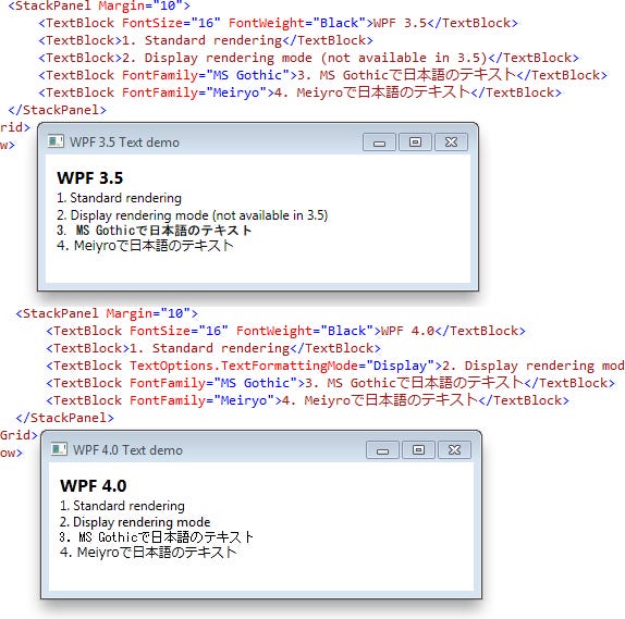
Just to hammer the point home about how important it is to upgrade to .NET 4.0 if you are using WPF, here are some comparison screenshots of the text rendering in WPF 3.5 and 4.0:

Pay attention to the difference between the text rendering on lines 2 and 3.
Line 2 shows the new Display formatting mode available in WPF 4.0. This renders the text the same way as the rest of Windows – the shape of the font is distorted so that lines fall on pixel boundaries. For small text this should be used for consistency with the rest of Windows or users will most likely complain that your text looks “blurry” (even though it is technically rendered correctly). Large font sizes or high DPI screens can stick to the standard WPF rendering mode.
Line 3 shows what Japanese Windows XP users will see if they use your application as they don’t have Meiryo installed. In WPF 3.5, Asian text is a mess at small font sizes because WPF 3.5 does not support bitmap fonts – instead it scales down the large vector font data in the font file. WPF 4.0 supports bitmap fonts so that Japanese text now is rendered the same way as the rest of Japanese XP.
It is worth being reminded that it took Microsoft themselves to dogfood WPF 4.0 when developing Visual Studio 2010 before these problems were solved.


